


A few weeks ago, CliqStudios wrote about Color Marketing Group’s color of the year, Re-Blued. This color was selected based on the ubiquity of blue across their worldwide color forecasts. According to CMG, comfort with the hue will lead to blue being popular for the next few years.
In tune with CMG’s prediction, AkzoNobel, a leading global paint and coatings company and supplier of paints and stains for CliqStudios.com, has recently selected Inspired Violet as its color of the year for 2013. At first glance, Inspired Violet looks much more purplish than blue. However, AkzoNobel refers to Inspired Violet as an indigo, which color enthusiasts will point out as a deep blue.
You’ll notice in the promotional visuals for Inspired Violet that the aqueous blues CMG highlighted are commonly paired with AkzoNobel’s new color. This further emphasizes the idea that popularity of blue really is on the upswing.

Inspired Violet
The reason behind selecting Inspired Violet goes far beyond than simply falling in line with the trends. For years, commonly used blues primarily featured a tinge of teal. What’s exciting now, however, is that purple is easing its way to the front and center of blue. It’s a refreshing take on the familiar.
AkzoNobel acknowledges our all-to-often rushed and hectic lives. They call this striking indigo a “visual band-aid” that evokes wisdom, honesty and a sense of calm. We’re comfortable with deep blues because they’re associated with trust and authority. Inspired Violet also carries an allure that suggests there’s more than meets the eye. It’s an intriguing color that can be refined and elegant, as well as playful and wondrous.
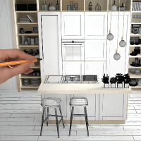
Using Inspired Violet in Your Home
Inspired Violet is a bold yet versatile hue. It works well with warm neutrals, like creams and beige. It’s also a great complement to bright, citrusy colors. As I described earlier, Inspired Violet pairs especially well with other blues. AkzoNobel advises using Inspired Violet and other blues in spaces that get ample natural light to bring out the subtleties of the color. For a fresh contemporary look, combine Inspired Violet with rustic finishes, natural woods and other coffee-inspired tones. Overall, “the new look is to keep things simple,” AkzoNobel says. Keep wall colors to a minimum and add texture and pattern in other elements in the room.
With CliqStudios kitchen cabinets, blues work better with our painted finishes. Try using Inspired Violet with Painted White, Painted Cream and Light Gray cabinets. With our stain finishes, use blues in accent pieces and décor rather than in major elements of the kitchen.
